List box
Graphical control element
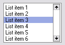
A list box is a graphical control element that allows the user to select one or more items from a list contained within a static, multiple line text box. The user clicks inside the box on an item to select it, sometimes in combination with the ⇧ Shift or Ctrl in order to make multiple selections. "Control-clicking" an item that has already been selected, unselects it.
A list box is called select or select1 in the XForms standard. Select is used for allowing the user to select many items from a list whereas select1 only allows the user to select a single item from a list.
HTML
In web forms, the HTML elements <select multiple> and <option> are used to display a listbox: [1]
<select multiple>
  <option>List item 1</option>
  <option>List item 2</option>
  <option>List item 3</option>
  <option>List item 4</option>
  <option>List item 5</option>
  <option>List item 6</option>
</select>
See also
- Drop down list - Like a list box, but not permanently expanded to show the elements of the list.
- Combo box - Like a drop down list, but users also can make entries not on the list.
- Scrollbar
References
- ^ "HTML <select> multiple Attribute". W3Schools.
- v
- t
- e
Graphical control elements
- Adjustment handle
- Button
- Context menu
- Drop-down list
- Hamburger button
- Menu
- Pie menu
- Checkbox
- Color picker
- Combo box
- Cycle button
- Date picker
- Grid view
- Toggle switch
- List box
- List builder
- Radio button
- Scrollbar
- Search box
- Slider
- Spinner
- Text box
- Balloon help
- Head-up display in computing
- HUD in video games
- Icon
- Infobar
- Label
- Loading screen
- Progress indicator
- Sidebar
- Status bar
- Toast
- Tooltip
- Accordion
- Tree view
- Client-side decoration
- Disclosure widget
- Frame / Fieldset
- Menu bar
- Panel
- Popover
- Ribbon
- Tab
- Toolbar
- Window
- Workspace
This graphical user interface article is a stub. You can help Wikipedia by expanding it. |
- v
- t
- e


